AmaWaterways unveils rebrand with new logo and redesigned website
AmaWaterways has unveiled a new logo, colour palette and imagery to reflect its “heritage and vision for the future”.
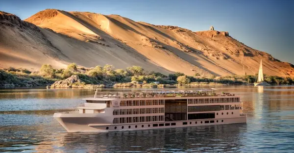
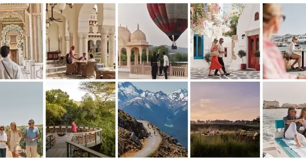
The new logo is inspired by the river specialist’s musical heritage, the “vibrant colour palette” by destinations visited and refreshed imagery stars real guests and crew.
The luxury river operator has also launched a redesigned website which promises to be “more intuitive, engaging and visually immersive”, with “richer imagery” and “enhanced booking tools”.
The rebrand comes after AmaWaterways launched two ships in Colombia last year and added eight ships to its European orderbook, which will take its global fleet to more than 40 ships by 2030.
Chief executive Catherine Powell said: “Our rebrand reflects who we are today and where we are going.
“There is a warmth and elegance to the new colours, and a more authentic way in which we are expressing ourselves that feels true to the AmaWaterways spirit.
“We are bringing our personality, passion and sense of discovery to life more clearly than ever before.
“There is such an exciting momentum in river cruising right now and we want a brand that truly cuts through, that people feel connected to and know immediately what it stands for."
Chief brand ambassador and co-founder Kristin Karst added: “As one of the founders of AmaWaterways, it fills me with joy to see how beautifully our brand has grown while staying true to the spirit that inspired us from the very beginning.
“From our first sailings to the global community we cherish today, every step has been guided by a passion for heartfelt service, cultural connection, and creating spaces where travellers feel truly cared for.
“This refreshed brand identity celebrates how far we’ve come, and I am incredibly proud of the team that brought it to life. Looking ahead, I am more confident than ever in our future and excited for all the new journeys and meaningful moments we will share with our guests in this new era.”


